Here are some sketches I did for my monogram logo! (Using my initials, Aina Nur-Ruhizan).
Out of all my sketches (I tried to develop as many as I could and exhausted different variations), two got chosen by Ms. Lisa for me to further develop. They're the ones in the box with the tick.
We both like the pencil monogram because it's kinda like a visual puns, and you know I love a good pun. 8)
The second monogram got chosen because it looked very elegant and simple, according to Ms. Lisa. Here, I varied the angle of slope on the diagonal line of the letter "N".
After finalising our designs, we then had to make stencils out of them by cutting them on a plastic sheet. The sheets were actually quite cheap- we bought them at the campus stationery store and they were only about 20 cents each, if I recall correctly.
Ms. Lisa demonstrating how to cut our stencils!
Our main goal doing these monogram stencils is so we can paint them on different objects and surfaces.
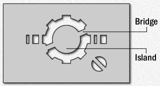
I did a prototype of the stencil but failed, only to realise I had to put a "bridge" to my stencil so that the "island" will stay!
(thank you wikipedia)
Further developing it, I decided to change the position of the "R" so that the lines would be more paralell and look more like a pencil.
This is what we took home with us!
Deciding on what things to monogram is going to be interesting.


No comments:
Post a Comment